Have you heard of dopamine dressing? Well, dopamine décor offers a way to curate joy in your surroundings as well. Speculated to be largely driven by Gen Z, according to Pinterest Predicts 2025, searches have risen by 280%. This signals a major cultural shift in how we design and inhabit our living spaces. Instituto Maragoni speculates that Gen Z has been embracing this rising interior design trend. It is replacing beige with bold colors to boost mood and self-expression at home. Read on to discover how you can update your design aesthetic with this uplifting direction!
Extreme mood-boosting
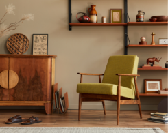
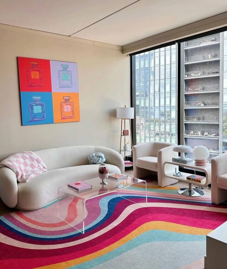
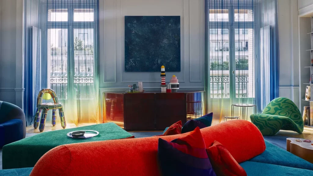
Dopamine décor plays into well-being, using vibrant hues to infuse positivity into daily life. The aesthetic uses color to create “bursts of joy,” countering the anxiety and monotony of minimalist interiors. As reported by the Associated Press, this aesthetic gained momentum after pandemic lockdowns, when people began reimagining their homes moving from neutral refuges to inspiring spaces. On TikTok, #dopamineroom showcases bland spaces transformed into vibrant, personality-filled makeovers. Lacquer red, acid green, electric blue, and sunshine yellow marked a bold break from last decade’s Scandinavian minimalism. Paired with neutral surfaces like light wood floors or white walls, these vibrant tones created striking yet balanced environments.
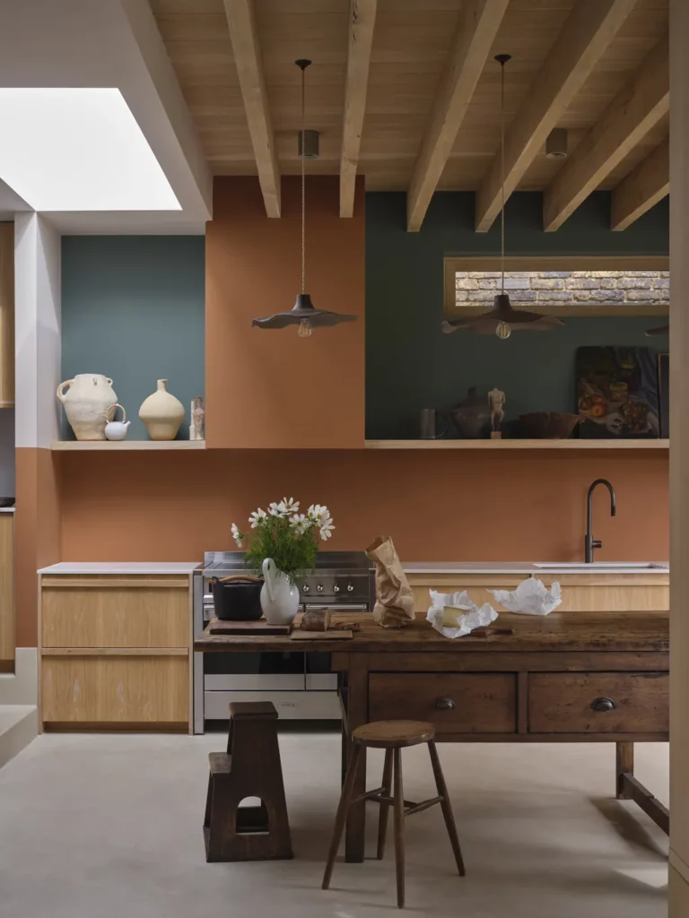
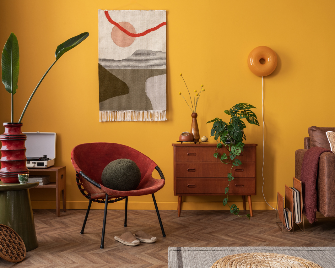
As the movement shifts into autumn, the dopamine palette transitions from ultra-bright toward richer, more layered tones. Think earth tones rather than neons. For reference, the new dopamine palette takes cues from this Farrow and Ball color chart. Two of the 12 new colors include terracottas, a buttery yellow, and rich greens and browns. These shades also ground the original almost-primary colors: resulting in a sophisticated look instead of overtly loud.
Dopamine drops from global designers
Top interior designers are championing dopamine décor principles. For bold inspiration, you might follow these interior designers, artists, and stylists on Instagram. French-Iranian designer @indiamahdavi, the “queen of color,” is known for bold spaces like the Coburg Bar and Miami’s Townhouse Hotel. British-Nigerian artist @yinka_ilori brings hyper-colored storytelling to interiors such as Dulwich’s “Colour Palace.” Transitioning from apparel to home, ‘90s British designer @matthewwilliamson translates vintage and botanical inspiration into wallpapers, fabrics, and furniture. London-based Swedish designer @beataheuman, known for her theatrical, colorful style featured in House & Garden and AD, also launched her own paint line, The Dependables.
Design without permission slips
Today, neutrality feels like a missed opportunity to tell your unique story. Forget matchy-matchy palettes, patterns, and trend-approved tones. In dopamine décor, even a single joyful touch, a hand-painted vase, patterned lampshade, or whimsical drawing—can transform a room’s mood. Consider one of the variations of this pooky Bayou table lamp, combined with ARKET’s patterned pouffe or bold wool blanket. Search Amazon for “dopamine decor” and you can easily find some colorful art! In need of advice and direction? Take a look at enthusiast Kate Rose Morgan’s Instagram and book to help you “Style your home with color, joy and fun!”
On social media, people get bombarded with endless “shoulds”: dopamine décor invites them to trust their instincts and create spaces that feel authentic. After all, what if the biggest “should” includes that we design the places where we spend most of our lives to make us genuinely happy? Last Autumn, Symrise reported on the feel-good decorating trend of “Falloween,” and thoroughly supports the use of design for joyful surroundings in the cooler months ahead!